Web Form Design: Filling in the Blanks

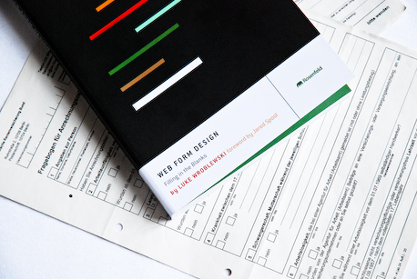
I hate forms. Germany is full of bureaucrats that love them, but their forms are amongst some of the most poorly designed I have ever encountered. The ones lying under the book in the picture above have been sitting on my desk for a year waiting to find someone who can understand them. A year! What a sad indictment – whoever designed those should be weeping right now.
By rights a whole book devoted to Web Form Design: Filling in the Blanks

Web Form Design is written from a position of sympathy with everyone who has had to struggle through a bad form, and that is pretty much all of us. Wroblewski lays out his stall right from the outset:
Forms suck. If you don’t believe me, try to find people who like filling them in. You may turn up an accountant who gets a rush when wrapping up a client’s tax return or perhaps a desk clerk who loves to tidy up office payroll. But for most of us, forms are just an annoyance. What we want to do is to vote, apply for a job, buy a book online, join a group, or get a rebate back from a recent purchase. Forms just stand in our way.
What makes this book so engaging is Wroblewski’s insight that forms are the social interaction part of any web experience. Forms are conversations between us and the company whose web site we are on. When we go to a real-life shop, we are usually greeted by an assistent or have some kind of social interaction whilst paying for our shopping, even if it is just “have a nice day” or “thank you”. Or we might have a pleasant interaction when unpacking a product:
“Unpacking a new Apple MacBook Pro is a tactile, engaging experience that reflects the quality of the product inside."
Forms are everywhere online. Whether it is a simple log-in, a purchasing or sign-up process or an online application, you can’t escape them. Wroblewski argues that many web forms are like a stranger coming up to and demanding to know your all your personal and bank details without so much as a “Hello”. When something goes wrong, the worst of them just leave you in the lurch and even the some of the best of them stare at you with an accusing error message without any hint of what to do about it. Even taking a few hints from Web Form Design could save us all from that unpleasantness and frustration.
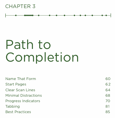
To tackle the subject, the book is divided into three sections:
Form Structure describes how to go about designing and organising forms that help people complete them and their goals, which is actually what they want to complete, not the form itself. This also includes the practical tasks of trying to manage vying needs of marketing, business and usability requirements as well as deciding if you even need a form at all.
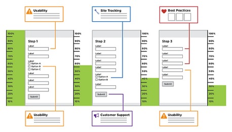
“In the eBay registration redesign, customer support, usability findings, and site tracking data were used to illustrate major issues. The entire flow was mapped out page by page with site click-through data that illustrated user drop-off and best practice analysis."
Form Elements covers the nitty gritty of labels, alignments, input fields, actions, and messaging, such as help, errors and success. Throughout this and the other sections there are plenty of clear examples and best-practice approaches on hand.
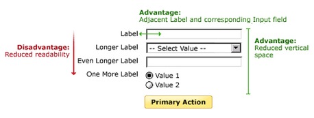
Some of the pros and cons of right-aligned labels.
Form Interaction focusses on the process of filling in forms and covers issues such as auto-validation, input types and how to engage people in the process from a human point of view, not an “inside-out” point of view of the company or the developers.
The above descriptions of the sections makes it sound rather dull, because forms are dull. But don’t be misled by that because Wroblewski really brings the user experience to life as he works through the examples as well as case-studies and perspectives from other designers. It all is this attention to detail that makes all the difference.
One case study from Jared Spool describes how a simple change made an enormous difference to an online store that had previously forced shoppers to register before checkout:
“The designers fixed the problem simply. They took away the Register button. In its place, they put a Continue button with a simple message: “You do not need to create an account to make purchases on our site. Simply click Continue to proceed to checkout. To make your future purchases even faster, you can create an account during checkout.”
The results: The number of customers purchasing went up by 45%. The extra purchases resulted in an extra $15 million the first month. For the first year, the site saw an additional $300,000,000.”
Web Form Design is not about Wroblewski making a dull subject interesting, instead he shows that forms are, in fact, central to the user experience and can be painless at the very least and sometimes even engaging and entertaining when done well. His clear and readable writing style is displayed in an equal clarity by Susan Honeywell’s crisp design of the book.

Rosenfeld Media’s founder and publisher is Louis Rosenfeld, who wrote Information Architecture for the World Wide Web
So, who is this book for? Interaction, user-experience designers and usability folks for sure, but it’s the kind of book that everyone from CEOs and marketing departments through to developers and project managers and German government departments should read.
Eric Meyer sums it up best on the back cover:
‘If I could only send a copy of Web Form Design to the designer of every web form that’s frustrated me, I’d go bankrupt from the shipping charges alone. Please. Stop the pain. Read this book now.’
You can support The Designer’s Review of Books by buying Web Form Design from Amazon.com


