Interaction of Color by Josef Albers
Review by Carolina de Bartolo
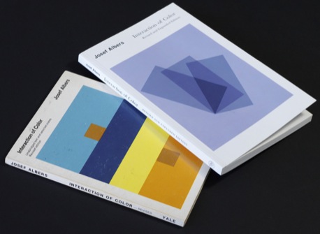
I’ve long thought of Josef Albers’s Interaction of Color as the one and only book you’ll ever need to understand how to use color as a designer. Originally published in 1963, Yale University Press published a lovely revised and expanded edition in 2006, which is 3.25 cm (1.25 in) taller and includes a number of additional color plates.
(Click to enlarge)
Designers tend to think of Josef Albers (1888–1976) only as a color theorist because Interaction of Color is a classic design school text. However, outside of the design world, Albers is better known as an abstract painter. His work, particularly his Homage to the Square series, influenced Op-Art artists who furthered his explorations in human perception or “the discrepancy between physical fact and psychic effect.” He was the first living artist to have a solo show at The Metropolitan Museum of Art in NYC.
“Color is fooling us all the time. All the time, like women do, you see, life is interesting.”
This slim volume does not belie the fact that the book contains a succinct, concise and, at times, downright poetic statement of color theory. Although I use the word “theory” with caution as Albers always asserted that he had not built and was not presenting any new theory of color, only an approach to studying it.
“In my color book there is no new theory of color. But, in it, there is a way to learn to see.”
(Click to enlarge)
Trained as a teacher, Albers taught German schoolchildren “everything—reading, writing and arithmetic” and it seems to me that, while his way of teaching university art students about color is highly advanced, it yet shows evidence of a certain “grammar school” pedagogy: Begin at the beginning. Experience is the best teacher. Repetition and discipline are necessary for learning. A good teacher of children cannot merely provide all the answers, he or she must initiate the process of asking questions and seeking truth.
“I have not taught art. Instead of art, I have taught philosophy…I never have taught [techniques for] how to paint. All my doing was to make people to see.”
(Click to enlarge)
Albers recognized that whether you teach at the grammar school or university level, the only thing educable in human beings is awareness. Robert Rauschenberg, who was his student at Black Mountain College and admits hating Albers’s critiques said, “Twenty-one years later, I am still learning what he taught me.” Often the quality of instruction can only be gauged in the fullness of time.
Here are some of the core principles from Interaction of Color that I find most useful and relevant for designers:
Color is the most relative medium in art. The. Most. Relative. Medium. In. Art. I doubt you can truly know this principle until you have the experience, as I have, of sifting through a packet of Color-Aid® in order to accomplish the exercises in this book, because…
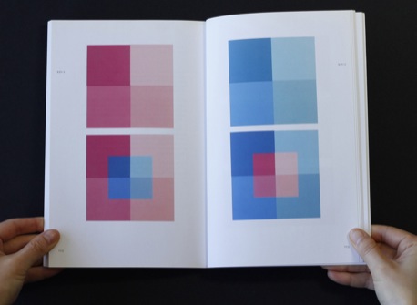
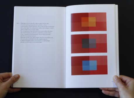
Experience is the best teacher of color. There is no shortcut to your 10,000 hours towards mastery of this subject. Unless you experiment with colors in the manner in which Albers prescribes, you will not fully grasp how the exact same color can look different in a small quantity than it does in a large quantity or how the same color looks different surrounded by another color. “We can hear a single tone but rarely do we see a single color unrelated to other colors.” Therefore, color is constantly related to its neighbors and to changing light conditions.
“Anyone who predicts the effect of colors proves that he has no experience with color.”
- It is difficult to visualize specific colors. Visual memory is very poor by comparison to auditory memory.
(Click to enlarge)
“Ask a group of people to imagine Coca-Cola red and everyone will imagine a different color. While we are able to repeat a melody we’ve heard only once or twice, we have difficulty reproducing a color we’ve seen a thousand times.”
People have strong preferences in regard to colors. In addition, people have strong associations with particular colors or color combinations—reds and greens together represent Christmas, pink is feminine, green is eco-friendly, etc.
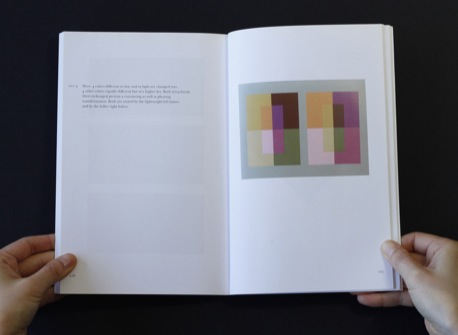
Few people are able to distinguish tonal value in different hues within close intervals. In other words, it is more difficult to see whether a blue and an orange are of equal, greater or lesser value than it is to distinguish values within shades of the same hue (e.g., two different shades of blue). There are exercises in the book that will help you to become better at this.
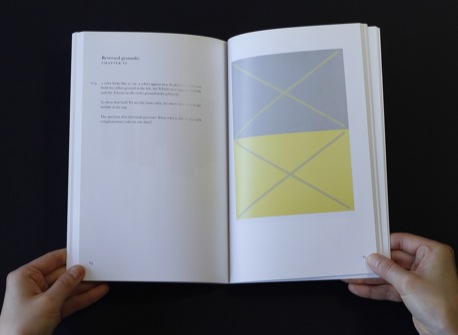
When two colors have the same value, they “vibrate.” Because the eye reads value more than hue, vibrating colors compete for the eye’s attention and are uncomfortable to look at. This is especially important in typography because colored type on a colored background must retain adequate tonal contrast in order to be legible.
(Click to enlarge)
While there are innumerable colors, in most of the world’s languages, there are only about 30 names for different hues.
Any color can “go” or “work” with any other color, it is principally a matter of in which proportions they are used. Albers often required students to use colors that they disliked in order to have them realize this relational aspect of color. You might say there are no ugly colors, only ugly uses of color.
“I have said to my students ‘I am putting you into a vacuum and asking you to breathe.’”
I am not a student of Albers, but this book is my teacher. I learned his principles of color in a freshman design course over 20 years ago, and today it is difficult, if not impossible, to reconstruct or evaluate how great an effect they have had on my work and my career. I retain them in memory, use them both in work and in life, in theory and practice, and teach them to my students. The concision and correctness in this book is rare and admirable. It’s an eternal gift to the world of design.
(Click to enlarge)
Interaction of Color by Josef Albers is published by Yale University Press. You can buy it via Amazon (US|UK|CA|DE) or through The Designer’s Review of Books Amazon store.
About the Reviewer
Carolina de Bartolo has taught typography and design history at the university level for the past 10 years. She has also authored a number of online courses in these subjects and recently developed a semester-long course on grids for graphic designers. Her upcoming book, Explorations in Typography: Mastering the Art of Fine Typesetting, is co-authored with Erik Spiekermann and will feature over 100 FontFont typefaces.
Credits
Albers quotes from the book and from “Oral history interview with Josef Albers, 1968 June 22–July 5, Archives of American Art, Smithsonian Institution.”
Robert Rauchenberg quote from the film, Josef and Anni Albers: Art is Everywhere, 2006.
Photos by Chiharu Tanaka.


