Three Books on Colour - Part Two: An Eye for Color
(Click to enlarge)
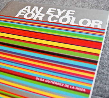
An Eye for Color

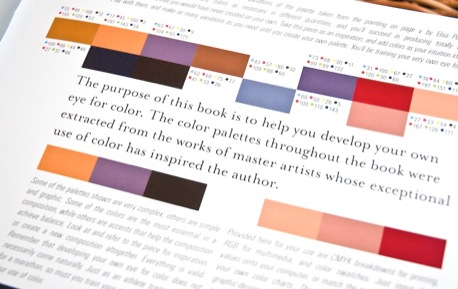
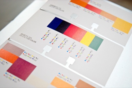
I was initially a bit skeptical about yet another book on colour, especially these days with sites like Adobe’s Kuler and Dr. Woohoo’s In The Mod and because Gutierrez de la Roza has created a set of Rolodex cards for each palette, which seemed to be an almost quaint touch in a digital world. On closer inspection, An Eye for Color has more to it than just some nice palettes. Gutierrez de la Roza’s main aim is to help you do it yourself:
“Developing your own eye for color does not necessarily come naturally. Just as an athlete trains his body for a marathon, so must you train your eye and mind to perfect your use of color.”
(Click to enlarge)
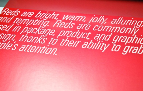
Physically the book is bound with a thick board cover of the children’s book variety and feels like the kind of thing that could be put to regular use in a busy studio without much wear and tear. On the design front I found the ever-changing typography a little irritating and the layouts often felt a bit crowded, but the sections and flow are clear enough. And, yes, seeing the palettes on paper is more pleasant that viewing them on screen.
(Click to enlarge)
Some designers, like Veerle Peters, seem to have an instinctual knack for colour combinations. Having worked digitally for a very long time, I find myself faced with such a large range of colour choice that choosing an ideal combination seems impossible. It’s a classic example of The Paradox of Choice
My eyes and mind need the aforementioned training and it is here that An Eye for Color trumps the online, on-screen tools like Kuler. Sure, you can upload your own images to Kuler and let it automagically create a colour palette from it, but it doesn’t tell you much about why that palette works or not, nor does it provide any context.
(Click to enlarge)
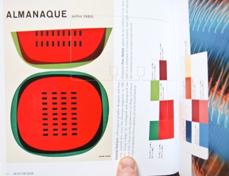
Drawing upon a range of source images Gutierrez de la Roza analyses everything from artists such as Degas, Rothko, Kandinsky, Hokusai and Warhol through to photographs, prints and collages. Her descriptions contain all sorts of nuggets of interesting information about the image or artist as well as her own analysis of the colour palette. For example, there is apparently no official reason why the Continental Congress chose the colours they did for the American flag in 1777 – they were only attributed meanings five years later.
I also appreciated Milton Glaser’s honesty when discussing his method: “I don’t think about the colors I am going to use. I just use whatever I feel like using.” I can hear the sound of design students high-fiving all over the world.
(Click to enlarge)
This intuitive approach to colour use is the paradox of An Eye for Color or, indeed, any other book on colour. It avoids getting bogged down in colour theory (which might be a negative for some) and is certainly a more practical studio resource than Kelvin: Colour Today
Buy An Eye for Color from Amazon.com


Look out for the final review in our Three Books on Colour series – Victoria Finlay’s Color: A Natural History of the Palette


