Tauba Auerbach: 50/50
(Click to enlarge)
Guest review by Andrew Shea.
Tauba Auerbach manages to distill the content of her latest book, 50/50
Auerbach is on a roll; 50/50 is her eighth publication since 2003 (each chronicling her progress as an artist), an impressive record for any 28-year-old visual artist. While Auerbach’s last book, How To Spell the Alphabet
(Click to enlarge)
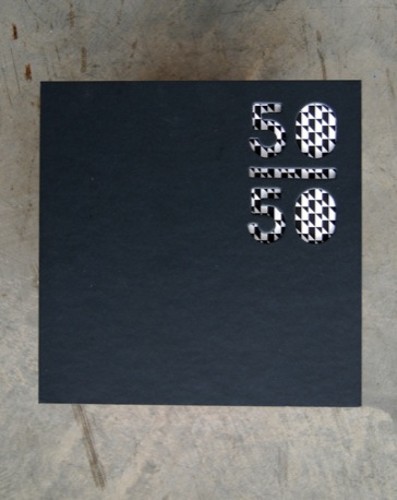
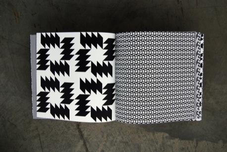
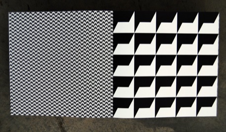
Auerbach’s fascination with patterns shows on every page of 50/50, starting with the cover: each side has a die-cut peephole that spells ‘50/50’ and gives a glimpse of what to expect inside. The patterns on each of the following pages are half black and half white, serving as Auerbach’s creative constraint.
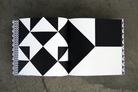
The 100 pages within follow in no particular order except when a series of shapes on one page combine to form a shape that relates to a similar configuration on the next page. Computer icons, picnic blankets, TV static, as well as standard geometric shapes like circles and triangles inspire the compositions on each page.
(Click to enlarge)
Some will complain that Auerbach’s use of these simple shapes does not warrant a book being published on the subject. This criticism overlooks how Auerbach repurposes the forms she appropriates in order to create a deeper level of symbolism in her compositions. 50/50 is a collection of signs, a semiotic treasure trove that can be reinterpreted by those who are patient enough to sincerely evaluate it.
Paging through the whole book is an addictive process; each pattern captures the glace and drags it along undulating forms until the eyes glaze over. Giving in to this temptation may temporarily paralyze your gaze but stepping back from the intricacies of the canvas will help you to start seeing configurations that work together differently from a distance. For example, a pattern may appear flat and static when you focus on its details but then jump off the page when you look at the whole canvas.
(Click to enlarge)
Our ability to make sense of these patterns on the micro and macro scale highlights Auerbach’s talent in designing visual systems and environments that others can interact with. In this sense, 50/50 has succeeded in replacing the written word with patterns that morph into a visual language.
Not many books can be analyzed solely by their physical characteristics but Auerbach gives us no choice. By limiting the text of 50/50 to one descriptive line, we are forced to decipher the logic of its shapes and patterns and, in the process we elevate visual language and interpretation. Designers would fine inspiration in Auerbach’s ability to graphically transpose her unique conceptual pursuits. Fortunately, the thoughtful construction of 50/50, including the delicate hardcover and the intricate patterns that bleed off every page, make this process of interpretation an enjoyable one.
50/50 by Tauba Auerbach is published by Deitch Projects.
[If you liked this, you might enjoy the review of Kapitza’s book, Geometric – Ed.]
Buy 50/50 from Amazon.com


About the reviewer
Andrew Shea is an artist and designer living in Baltimore, MD, where he is earning his MFA in graphic design at Maryland Institute College of Art and is one of Ellen Lupton’s Design Writing Research students.


