A Practical Guide to Designing for the Web
(Guest Review by Shannon Smith)
Mark Boulton just saved me a ton of money on design school.
His new book, A Practical Guide to Designing for the Web, is meant to help Web designers who haven’t been to design school ‘learn the basics of graphic design and apply them to their Web designs – producing more effective, polished, detailed and professional sites.’ I definitely fall into that category.
(Click to enlarge - Picture: Mark Boulton Design)
Of course his book isn’t actually a replacement a full design degree. Unless it is. As a freelance designer, the chance of having the time, and of course as I’ve already mentioned, the money, to go back to school for a design degree are slim. And, like many designers, I already have a degree or two under my belt that bring other skills to my work, not to mention clients knocking at the door.
Nor is this book Web Design 101.
‘I wanted more of a conversation. More informal, more of me. The content is still practical, but it’s not a lesson plan.’
(Click to enlarge)
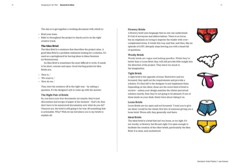
The result is an easy-to-read 264-page book of 25 chapters divided into five sections. The first two sections, Getting Started and Research and Ideas, mainly cover getting started as a Web designer: where to work, how to get ideas, what the design process looks like and a section on setting yourself up as a freelancer.
(Click to enlarge)
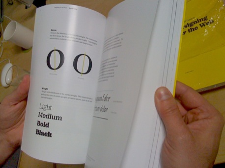
Design school comes next: Typography, Colour and Layout. Those last three sections contain the best, most clearly written, easy-to-use explanation of basic design principals I have ever read.
Some of the material will be review – hopefully everyone has at least heard of the Golden Section/Golden Ratio. However much was new and interesting to me. The use of triangles in design is not often covered in other design books. The hierarchy of fonts, though not a new concept, is so well presented in an easy-to-use chart, that I was able to use it to examine my own designs right away.
(Click to enlarge)
Boulton goes further, using his 15 years of experience in Web design to apply those design school concepts to the real world, or at least virtual world of Web design.
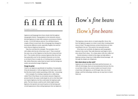
Learning how to classify fonts into families is interesting, but Boulton takes typography into the world of pixels and fluid layouts. As a Web designer I’m not sure I’ll ever quite master the proper use of hyphens, n-dashes, and m-dashes that Boulton recommends. Ligatures-use will only come into play in rare circumstances and are still not fully supported on the Web. Still, the information is good to know.
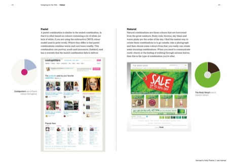
The section on colour is similar with some basics at first, followed by more in-depth treatment with the whole being applied to the Web. Some of the colour combination examples, and the information about how to use them on the Web were immediately, intuitively useful. I can’t wait to test out those patterns on my next designs.
(Click to enlarge)
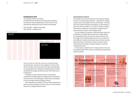
Then there are grids. It’s a subject Boulton has written and spoken (PDF) about extensively. Boulton covers how to build a basic grid system, how to prototype with a CSS framework (in this case Blueprint) and then how to break the grid for effect. He also touches on the challenges of using grids on the Web, including browser incompatibilities, and the usefulness of new Web technologies, including HTML 5 tags. Each step is illustrated with examples from his own work.
(Click to enlarge)
This book is exceptionally useful, and the timing couldn’t be better.
‘Simple, sophisticated graphic design is making a shift from the online world to the Web as more designers are ï¬nding that the tools which were formerly so constrictive – the browsers – now allow them to create the layouts that once were difficult or impossible. The Web is looking good, and will only get better.’
There is a sample pdf online and you can also read the original blog posts that inspired the book. But with a PDF version at £12 and a printed one at £29, buying the book with its additional content is well worth it.
A Practical Guide to Designing for the Web by Mark Boulton is published by 5 Simple Steps. 264 pages. Boulton’s third book, Designing Grid Systems for the Web, is due out this fall.
About the Reviewer
Shannon Smith is freelance Web designer and developer and founder of Café Noir Design. She lives and works in Montreal.


