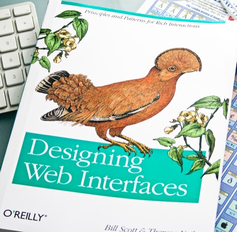
Designing Web Interfaces
Review by David Little
Theresa Neil’s and Bill Scott’s Designing Web Interfaces (Amazon: US


This book is about interaction design: specifically, interaction design on the Web… It is a distillation of practices, patterns and principles for creating a rich experience unique to the Web … The Web comes with its own context. It is not the desktop.
Scott and Neil have built their library of patterns on the back of many years’ experience; both as user experience specialists at Sabre, Scott’s involvement with the Yahoo! Design Pattern Library and Netflix and Neil’s work as a interface design consultant.
In just under three hundred pages the patterns are demonstrated and explained in terms of higher-level design principles. Although many of these principles relate to those long-established in the field of Human-Computer Interaction (HCI), readers need no background in it or interaction design to understand them. Any HCI jargon (e.g. “affordance”) is clearly explained and used only to aid understanding of a principle or pattern.
The book centres on six principles: “Make it direct”, “Keep it lightweight”, “Stay on the page”, “Provide an invitation”, “Use transitions” and “React immediately”. The principles are further broken down into a series of more specific examples which in turn contain a number of patterns.
Many of these patterns will be familiar to those who use the Web on a regular basis, although one might be sometimes hard-pushed to describe them with snappy titles as in the book, e.g. “detail overlay”, “affordance invitation” or “multi-field inline edit”. Unsurprisingly, all patterns come with their own challenges and possibilities of abuse which can lead to “anti-patterns”, to use Scott and Neil’s term.
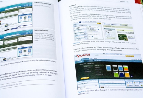
Each pattern is described in some detail, alongside colour screenshots (also available online via the book’s Flickr stream). These are followed by discussions of the considerations of using the technique and tips and summary lists of best practices. Even interaction styles which may seem on the surface reasonably straightforward are surprisingly complex when considered in-depth. For instance, the chapter on “Drag and drop” calculates that there are ninety “interesting moments” or states at which interaction is possible, ranging from what happens on page load, mouse hover to dragging to a valid or invalid target, or accepting or rejecting the drop.
(Click to enlarge)
Of course, if just one thing has been demonstrated in the Web’s history, it’s that if something terrible can be done, it certainly will be. The book’s anti-patterns demonstrate how to get interaction wrong, from classic examples such as “mystery meat” navigation where icons provide no obvious clues as to their functions, through to “mouse traps” where overlays get accidentally triggered, obscuring content and infuriating users, and my favourites, “needless fanfare” where interface elements are announced with pointless and pretentious animations and “animation gone wild” which speaks for itself (see the Nasa website for a bewildering example of this); as Neil and Scott state,
The primary purpose of transitions is to communicate, and no amount of graphic trickery will make a noisy interface compelling.
Whilst the book is detailed, well laid-out and written in a clear, engaging and often witty style, it suffers a little from its organisation. It is certainly useful to describe design principles; after all these stay more constant than particular interaction styles. But grouping the patterns by principle makes the book a little difficult to navigate. Although in essence a reference work, it is difficult to dip in and out of. Instead the reader will benefit more from reading chapters in their entirety and many principles and patterns cross-reference others.
I found the index more useful than the table of contents, although even that was not without its problems. For instance, the word “form” is not referenced, although patterns relating to forms are present throughout the book. Designers will also need to learn the vocabulary of interaction styles: knowing that a horizontally scrolling image gallery is called a carousel and the difference between an overlay and an inlay will certainly help in tracking down a particular pattern.
Its own Information architecture aside, the book is well designed: clearly aimed more at designers than a typical O’Reilly tech title, it features colour coding of principles, clear typography and many colour images. Some of the images are a little small and, as they try to demonstrate transitional effects, occasionally confusing. However, the book’s Flickr stream provides access to larger images and videos of transitions.
(Click to enlarge)
The book is also supported by its own website which allows for more interactive browsing of the patterns, alongside an actively maintained blog with entries by the book’s authors on further patterns and anti-patterns.
Hinted at, but not discussed in any depth in the book is the fact that all of the patterns rely on the use of technologies such as Javascript, Flash or Silverlight, all of which come with an accessibility overhead. Also, whether an interaction style is truly relevant to your website will only be revealed by testing it with your site’s users.
Designing Web Interfaces provides clarification on key Web interaction styles and their context. Pretty much indispensable for anyone involved in designing or developing websites, it is of course not a guarantee of success if used on its own.
Designing Web Interfaces is published by O’Reilly Media. You can also find it on Amazon (US


About the author
David Little is a Web user interface designer and developer, based in London. He blogs about Web UI matters and other more random topics at Littled.net, and occasionally tweets at @djlittle.


