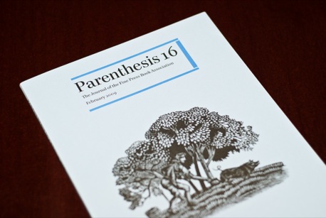
Parenthesis - Issue 16
Okay, I admit it. I expected Parenthesis, the twice-yearly journal of the Fine Book Association to be somewhat boring. I imagined dusty discussions of the nerdy joys of owning crumbling first editions and not a great deal to do with design. How wrong I was.
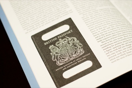
One of the first articles in Issue 16 is a tribute to Reynolds Stone by Alan Powers. “Reynolds who?” you may be thinking, as I was. It turns out he was the man behind the work of graphic art owned by the largest number of people in the UK – the cover of the British Passport.
(Click to enlarge)
Stone’s story is a fascinating one, including a chance meeting with Eric Gill on a train to Cambridge and an intimate knowledge of wood-block carving (the cover of Parenthesis 16 is one of his). He both illustrated books but also was a master of engraved lettering. Readers in the UK might know also know his work on the Dolcis logo (for which he was paid “a pair of shoes for life”) or the typeface Minerva, which used to be used for the article headings in the New Statesman.
Reynolds’ son, Humphrey Stone, continues the story of the journey from newspapers to shoes to banknotes:
“No doubt he was better paid for the five and ten pound notes, designed in 1963, portraying a new slimline Britannia. When Reynolds used his daughter Phillida to pose as the model for Britannia, she sat on a chair with a broom in one hand and a dustbin lid in the other. If the execution of the drawing is considered weak, it has to be admitted drawing people was not his strong point; the lettering was faultless.”
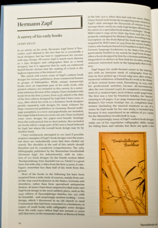
(Click to enlarge)
And so Parenthesis continues – one interesting insight into a world of carefully crafted lettering and printing to another. I found myself quite drawn in. In Jerry Kelly’s survey of Hermann Zapf’s early books it was also a surprise to find that the man behind Palatino and best known for his typography had an extensive career as a book designer, “embracing Rudolf Koch’s dictum that the making of a book is the highest expression of the letterer’s art”.
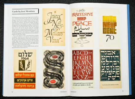
Then there is a beautiful collection of Christmas and New Year cards printed from hand cut lino blocks by French type designer, José Mendoza y Almedia. There is also an interesting article by Sophie Schneideman from Rare Books (someone offer to make her a nice web site please) in London’s Portabello about finding and selling rare books in the age of the Internet.
“It is also creating a generation of people who enjoy digging around on the net to research things, and then read as well as view … A potential book collector is more likely to find the rare and fine book world more than ever before.”
(Click to enlarge)
All in all there is a strange crossing of currents in this fine book world. On the one hand the digital world continues to have a huge impact on the printed book, but only to a degree. As the FBA’s UK Chairman writes, “I’m never sure whether things in the fine press book world are on the way up or down.”
The review of the “Letterpress: A celebration” event in the UK reports that it was sold out so early on that many people had to be turned away. Indeed there seems to be a kind of pleased bemusement at the rise of interest in these printing techniques:
“It was good to see so many students taking an interest in letterpress. Nevertheless, despite John Randle’s insistence on the importance of a reasonable quality of work, as well as imaginative design, in the books printed at the presses he talked about, one got the feeling that many of the younger listeners were seduced by the effect of type poorly inked or off its feet, as a reaction against the lifeless purity of offset lithography. One talk, by Patrick Walker of the Dust design group, was actually called ‘Printing badly on purpose’, and celebrated among other things the pleasures of setting limited quantities of battered type, while Alan Kitching and Celia Stothard demonstrated how the uneven inking of elderly wooden type, which would have horrified generations of poster printers, can be made into an exciting graphic medium when allied with creative layouts.”
This had me chuckling, because of course those are the reasons younger designers and typographers are interested in the letterpress. The physicality of it – the indentation into the paper, the not always perfect setting or inking – is what makes it so beautiful and special. Just as I was about to suggest someone makes a Twitter to letterpress link, it turns out they already have (and very nice they are too).
So, yes, I was mainly wrong in my expectations of Parenthesis. It is an insight into a fascinating world with fine examples of beautiful work. But there is a good dose of typographic and fine press nerdishness in there that should appeal to plenty of designers and it does have a kind of dusty club charm from time to time. If you enjoyed watching Helvetica, you’ll enjoy Parenthesis.
Parenthesis is available via membership of the Fine Press Book Association, for a pretty reasonable $48 or £35. If you want you can sign up for the De luxe membership in which you receive a special limited edition of Parenthesis, case-bound and presented in a slip case with a parcel of items specially printed by presses from around the world.
The web site also has an excellent list of resources and links to presses around the world.


