Jost Hochuli: Detail in Typography
Or to give it it’s full title: Detail In Typography, Letters, Letter spacing, words, word spacing, lines, line spacing, columns. (Amazon UK US)
Detail in Typography… is one of the more recent publications by Hyphen Press, the imprint set up by Robin Kinross; typographer, author & critic. Published for the first time in English in 2008, Detail in Typography… was first published in Switzerland in 2005 and it’s translation to English has given this slim book a much deserved wider audience.
Detail in Typography… is not just a guide to making clear & legible text. Hochuli also discusses what makes an aesthetically pleasing layout, and why layouts can still appear dull even after all the ‘rules’ have been strictly adhered to.
Covering all the elements which make up a column of text the book is split into the following chapters: The reading process, The letter, The word, The line, Line spacing & the column and The qualities of type. This segregation gives Detail in Typography… a clear and defined structure, reflecting the principles of the subject matter perfectly. Jost Hochuli also stresses that Detail in Typography… should not be regarded as infallible. Hochuli counts on “intelligent designers finding appropriate solutions”.
In the words of the author in his introduction:
“While macrotypography - the typographic layout - is concerned with the format of the printed matter, with the size and position of the columns of type and illustrations, with the organization of the hierarchy of headings, subheadings and captions, detail typography is concerned with the individual components - letters, letterspacing, words, wordspacing, lines and linespacing, columns of text. These are the components that graphic or typographic designers like to neglect, as they fall outside the area that is normally regarded as ‘creative’…
…There are many matters of detail typography which one can, in good conscience, resolve differently. The author would certainly not want this book to be regarded as an infallible catechism: rather, he counts on intelligent designers, who, in the spirit of this book, finds appropriate solutions to the problems that arise in a given context, even though not all potential problems are dealt with in this text”
Typography is happily no longer an esoteric art to the average designer and over the last few years there have been a plethora of typography books arriving on the market as the art of typography becomes increasingly accessible: we all now have the possibility of access to thousands of fonts, the expensive cumbersome metal type having made its way onto the desktop computer. With typography being such a huge subject Hochuli’s classification and definition of ‘micro typography’ (a term Hochuli first coined in 1987) makes Detail in Typography… another welcome addition to the range of useful and informative books on the subject of type.
For the established designer Detail in Typography… is a great refresher, a reminder of how concise composition can reside in the detail. For the student or the designer just starting out and wanting reference for typography I would say Detail in Typography… is essential - understand and appreciate ‘micro typography’ and students of design will have a solid foundation for dealing with all things type and type related.
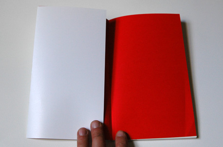
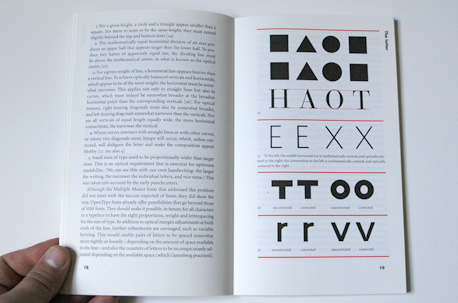
As with all Hyphen books Detail in Typography… is beautifully designed. The red and black colour scheme is striking and effective, the inside covers of solid red a nice touch. Hochuli always backs up his observations and comments with detailed illustrations and examples. Not only a useful text on type, a beautiful book too.
_ _For anyone interested in further reading on typography I would recommend the following two books:
_ _For a contextual look at the history of type I would recommend Modern Typography: an essay in critical history by Robin Kinross. Although currently out of print a re-print is expected soon. From the books back cover, a quote from Matthew Carter, Eye magazine;
“As a brief history of typography it is difficult to think how it could be better.”
I could not put it any better myself. The cover has also got an uncoated finish in bright yellow, although impractical and soon covered by my newsprint fingerprints, looks amazing.
Before this post becomes a Hyphen press love-in I would also recommend The Elements of Typographic Style by Richard Bringhurst for a wider look on the practical application of type. Often quoted as the ‘bible of typography’. But not by me.
About the Reviewer
Owen Priestley is a contributor to the arts, culture and politics blog www.20three.com. Owen is the Senior Art Director at Brighton digital agency Kerb.


