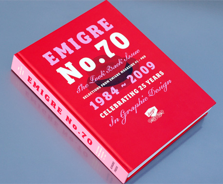
Emigre 70: The Look Back Issue
In order to understand what Emigre 70: The Look Back Issue is, you need to know what it is not. This is not a “new” issue of Emigre with interviews, letters, theories and experimentations that one would expect to find in a publication that claims to be an issue of Emigre. It is not a complete collection of the writing that has been featured in a magazine known for its critical design writing for the past 25 years, or a greatest hits picture book. In the words of designer and editor Rudy VanderLans this book is “a reprint of selected work that best illustrates what made this such an exciting time, and by extension provided a record of Emigre’s contribution to this particular era of graphic design.” By “this exciting time” and “this particular era” VanderLans is referring to the late 1980’s and 1990’s, a very interesting, and some would say contentious, time in the history of graphic design. And I agree, this is a good selection of work to represent this era of graphic design. What makes it particularly interesting is the included selections are based unapologetically from the perspective of Rudy VanderLans and the things that interest him.
“Ultimately I picked pieces that seemed to perfectly encapsulate what excited us at the moment, work that was revelatory, where ideas were put forward that expanded our notion of what graphic design could be. Some of the essays I picked simply because they caused heated responses from our readers. While others I picked because, upon rereading them now, they still seem entirely relevant.”
Other than images of covers and a few spreads, none of the work featured in Emigre 70 is from the many guest editors and special issues of the magazine, which gives the book a very focused and unified feel. Ultimately, Emigre was the result of the vision, interests and curiosities of Rudy VanderLans, and this book is no different.
My exposure to Emigre began with issue 55 from the summer of 2000, which I bought at a newsstand in Seattle. You could argue that the critical writing that made the magazine what it was had gone for good at this point and the issues following it were mainly formal exercises for VanderLans and type specimens for Emigre Type. There were some interesting articles in the later issues, and issues 64–69 were all writing, but the ability to really stir things up had passed. Because Emigre was not a publication that the universities I attended subscribed to and none of my professors had collected or subscribed to the magazine, issues 55–69 were all I had to go on until Issue 70 was released. The best thing about this collection is the reprinting of the early interviews with designers like Jeffrey Keedy, Katherine McCoy, Scott Makela and Rick Valicenti. These interviews are where Emigre 70 really shines. VanderLans is a wonderful writer and a skilled interviewer. He was not interested in giving the reader what he thought they wanted, or asking questions that allowed the selected designer to stay comfortable and talk to their strengths. He asked the questions he wanted answered, questions that interested and intrigued him. One of my favorite exchanges came in an interview with Jeffrey Keedy in issue 15.
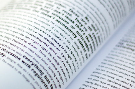
Mr. Keedy: The whole idea of irregular spacing works well with the computer. If you don’t pay attention to the placement of the characters when you draw them, you get irregular or bad spacing. It’s a byproduct of the machine. It takes a lot of time if you want the spacing to be right. You have to go in and create kerning pairs and all that. That’s a very conscious act. If you ignore that you get very bizarre spacing.
Emigre: But that is not something that comes out of the machine or the technology, it’s you not willing to spend the time to get it right.
The reprinted interviews are full of these types of exchanges with very important designers of the era. The other articles that have been reprinted are interesting and important from a design history point of view, but not nearly as interesting or revealing as the personal interviews conducted by VanderLans himself. And the book is worth reading because of them.
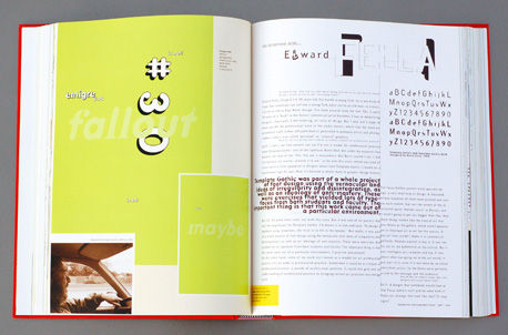
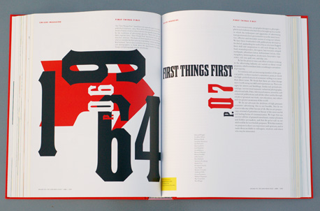
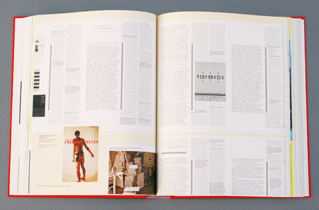
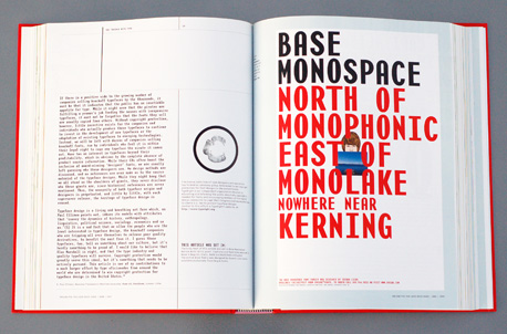
The formal evolution of the magazine is just as important as the critical dialogue, and because Emigre 70 reproduces spreads, interviews and articles (from the original digital files when available) as they appeared in the original publications, the viewer can watch this evolution before their eyes. It is a kind of strange, post modern flip book of design history. You can see the progression from the earliest editions that used nothing more than camera ready mechanicals, the early experimentations with low resolution computer generated type, the first completely digital issues and the emergence of VanderLans’s mature style. Even though this is not a complete collection of all of the formal experiments of its day, it is a great overview of the design of the magazine and will become an important visual reference for those that were not able to collect all of the issues as they were released.
If there is anything about this book that could be considered a disappointment it would be the physical production. The production values of the magazine always had a specific feel and texture through the use of inexpensive paper and uncoated mailing wrappers. The book is much too slick in comparison and doesn’t feel right for Emigre. The spot varnish on the cover and spine feels flashy and unnecessary, but that may be because I spent too long in the Middle East where they put a spot varnish on almost everything.
Production aside, this is a good book to have in your collection just for the interviews and visual development of the magazine. And if like me, you came a little late to the party,_ Emigre 70_ is a good summary of the history of arguably the most important design magazine of the late 20th century.
Emigre 70: The Look Back Issue is published by Gingko Press and is available from Amazon (US|CA|UK|DE).
About the Reviewer
Jonathon Russell is a designer and educator at Central Michigan University. More of his writing can be found here.


