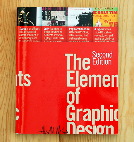
The Elements of Graphic Design, Second Edition
As a design educator I am always looking for new ways to teach the unavoidable “Introduction to Graphic Design” course. I have read and used many textbooks over the years, each with their own strengths and weaknesses. It was with the goal of gathering new information in the introduction to graphic design category that I read and explored The Elements of Graphic Design by Alex W. White. Like the other books I have read in this category (one that is large and continues to grow because it seems that everyone wants to be a graphic designer), The Elements of Graphic Design has both strengths and weaknesses.
Design - whether graphic, industrial, interior, or architecture - is the process of taking unrelated parts and putting them together into an organized unit. Each discipline works with solids and voids, and each must respond to three questions: What are the elements I have to work with? Where do these elements go? What structure is necessary so they go together?
The main strength of this book is the way the information is broken down. There are only so many ways that you can introduce and explain the principles and elements of design (balance, hierarchy, space, color, etc.), but this book does it in a way that I had not seen before. Rather than listing one at a time and discussing each, there are four sections: Space, Unity, Page Architecture and Type. The traditional principles and elements are then discussed in the context of these umbrella topics. I like this approach because it puts the different elements of design into a larger context that is easier for the student to understand. There is more connection between the different elements, and it is clear to see that the foundational principles and elements of design are not used in a vacuum, but interact with each other. This fact is one of the hardest things to help my students realize in introductory classes. For example, just because you are focusing on the use of scale in a project, does not mean that you can ignore balance or contrast. It is made clear that everything works together.
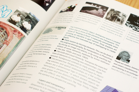
Another strength of The Elements of Graphic Design is the choice of example images. There is a good mix of illustrative graphics, historical and contemporary design to emphasize a point and exercises that can be given to the students as assignments. It is refreshing to see good quality contemporary examples from well known designers and firms. I have seen textbooks use examples that in most design courses would be shown as less effective pieces of graphic design. It is important for students to be exposed to contemporary design early in their education. Too many textbooks rely heavily on historical examples to illustrate the use of principles and elements of design. Historical work is important, and used here when appropriate, but students respond well to seeing work that is only one or two years old rather than two or three decades. Another nice feature is various quotes from well-known designers, which support the author’s text. The addition of each designer’s portrait is helpful in that they put faces to names and humanize work that a student may already be familiar with.
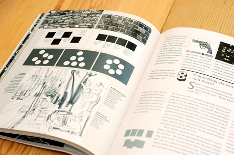
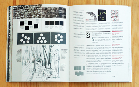
As strong as the content is, the design of the book is confusing. Every spread has four distinct but related areas of content. On the left page are examples of work that exemplify the subject of the chapter. The right page has a row across the top made up of another, smaller set of examples and explanations. There are also captions for the examples and exercises on the left page, the main content of the chapter and a portrait and quote from a well known designer. I had to read each spread four times just to get all the information, and then reread the last paragraph of the main text to remind myself of the topic before I moved on. It takes quite a while to get through everything, and there is a lot of information vying for your attention. The design is not bad, just very active with no clear focal point. Maybe this is good for students that are used to managing 3 or 4 distinct streams of data all at once, and they won’t have any problems gathering and absorbing the presented information. I found it a little confusing and hard to get through.
The Elements of Graphic design is a great resource with strong content that approaches a common problem from a unique direction and puts the principles and elements of design into a context that allows students to see how they work together. It is a shame that the design of the book makes the content harder to access than it should be.
The Elements of Graphic Design, Second Edition is published by Allworth and is available from Amazon (US|CA|UK|DE).
About the Reviewer
Jonathon Russell is a designer and educator at Central Michigan University. More of his writing can be found here.


