Just My Type: More Than A Book About Fonts

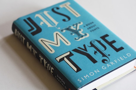
If every typography book were written like Just My Type: A Book About Fonts (Amazon: US|UK|DE), more people would care about the subject. British author and journalist Simon Garfield’s tone is so accessible, it feels like he lived through 600 years of history and just popped by to talk about it. Font geeks will enjoy his snappy vignettes on influential designers, why quick brown foxes jump over lazy dogs, and the life and death of something called an interrobang. For the casual font user, Garfield demystifies industry-specific hang-ups, such as the difference between a font and a typeface, or why someone might choose Gotham over Gill Sans. This is not a technical manual. It’s not merely “a book about fonts” as Garfield humbly suggests. Just My Type is a collection of stories about people — the men and women behind this age-old craft — and purpose — the way type has influenced culture and vice versa.
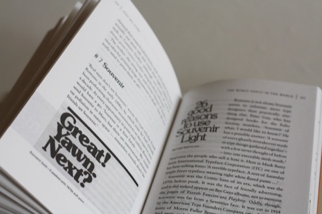
The book is divided into 12 short chapters that contain easy-to-read anecdotes with unexpected twists. About half of these are followed by “font breaks,” which go into detail about one or a few fonts. “Type is a living element,” writes Garfield. So the book is not organized according to classification or chronology. Instead the reader may choose from a tome of stand-alone stories which can be read in or out of order, as a whole or in parts. It begins with a defense of Comic Sans, but waits until the end to list “the worst typefaces in the world.”

Now may be the first time a book like this makes sense. In Garfield’s words, “Computers have rendered us all gods of type.” Everyone now uses fonts and many find pleasure in making their choices. But why should anyone care to learn about typography’s past? Garfield writes:
“One can wander around the streets admiring typefaces on signs and shops with not a care for their history. But it may increase our love of them if we know who made them, and what they were aiming for.”
Typophiles will pore over the chapter about Doves, the font that drowned. All will likely recoil at type designer Eric Gill’s various forms of experimentation (in and out of the foundry). The delicate swashes in the typeface Caslon make more sense when we consider that its creator first worked as a gunsmith. And typographer John Baskerville’s dishonorable burial is all too ironic since he first worked as an engraver of headstones. In a chapter called “Can a font make me popular?” Garfield describes designer Matthew Carter as a man who matches his type: “a classicist with a ponytail.” Carter’s love of type began with his mother, who cut letters out of paper and stored them in a box. Years later, when Carter found them, he discovered, “They were Gill Sans, and they had tooth marks in them.”

From Gutenberg to Gotham, type’s legacy is in social impact. Garfield shows how the invention of the first mechanical printing press, which was the inception of type in the 1440s, directly resulted in a more learned world. He discusses how the use of “a type consciously chosen to suggest forward thinking without frightening the horses,” helped elect President Barack Obama. This font, called Gotham, was more sophisticated, more contemporary and more flexible than the team’s original choice, Gill Sans.
Where will type go next? Garfield doesn’t talk about digital publications or web typography. But those who fear that print is dying can get some perspective by reading this book. History shows that every technological development — be it hot metal compositing (late 1880s), Letraset (1959) or the Macintosh computer (1984) — opened new doors for type design, even if it did send the industry into panic. Today’s advancements are coming at a faster pace, but type will surely endure. After all, “the leaden army that conquers the world” doesn’t have to be made of lead.

Throughout the book, Garfield questions the impulse to continue designing new typefaces. There are over 100,000 fonts in circulation today. And after 560 years of movable type, why do we continue to make more fonts? The question has been asked since Helvetica was a newborn. Jonathan Barnbrook, a renowned British typographer said in the book:
“Typography truly reflects the whole of human life and it changes with each generation. It may as well be the most direct visual representation of the tone of voice with which we express the spirit of the time.”
Garfield adds to this:
“The world and its contents are continually changing. We need to express ourselves in new ways.”
Will there ever be a perfect typeface — one that is legible, readable, versatile, beautiful and culturally stimulating? Of course not. No one font can be everyone’s type.
Publisher Information
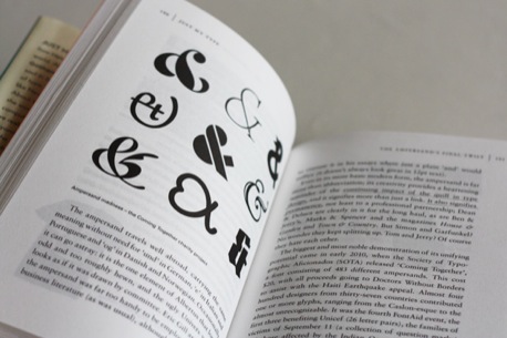
Photos above show the UK edition, published by Profile Books in 2010. _ Just My Type was also released in the Unites States by Gotham Books in September 2011._
You can support The Designer’s Review of Books by buying Just My Type from these Amazon links (US|UK|DE) or The Designer’s Review of Books Amazon store.
About the Reviewer
Aggie Toppins is an MFA candidate in graphic design at the Maryland Institute College of Art. She has worked for several years at agencies in Chicago and Cincinnati doing environmental graphics, brand identities and communication design. She is passionate about making work that helps people share their stories. A proud Midwesterner, Aggie currently lives in Baltimore with her husband Jason and her basset hound Jolly.

