Function, Restraint, and Subversion in Typography
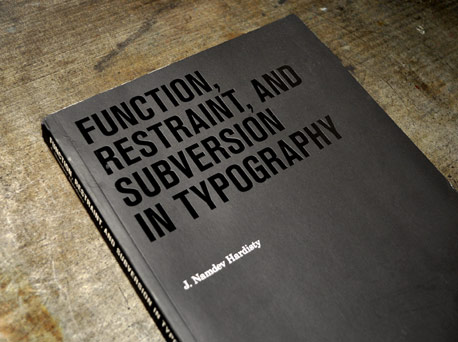
If you are a fan of minimalism, modernism or brutalism you will find Function, Restraint, and Subversion in Typography especially intriguing. The book, by J. Namdev Hardisty, surveys contemporary examples of the styles by detailing the work of many modern design studios. Many of the studios were familiar names in the design world, some were more foreign but still recognizable, and many were names I had not encountered before.
(Click to enlarge)
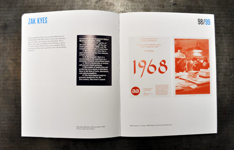
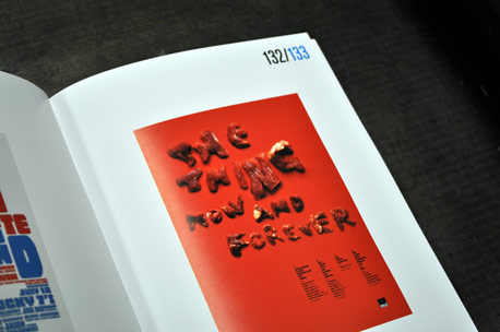
The emphasis is, of course, on typography and the book showcases the typographic work of 24 separate design entities. The author gives an overview of each studio, which usually contains small portions of their history, practice, and beliefs. The short excerpts are followed by several examples of the work produced by the studio being presented.
(Click to enlarge)
More often than not, the description relates directly to the pieces shown giving you a good idea of exactly what Hadisty is presenting.
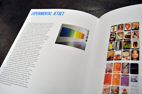
Projects like the Kelly 1:1 art installation, the John&Paul&Ringo&George T-shirt, the Stedelijk Museum CS identity system, and a slew of posters for various themed exhibitions have showcased the group’s talent for creating profound graphic works from simple concepts that also propogate their bold, almost Pop Art, take on Modernism.
(Click to enlarge)
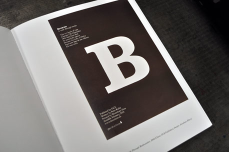
The layout of the book is clean and straightforward, complementing the work and information on its pages. Mixed in between the studio showcases are several interviews relevant to the styles of modernism and brutalism. The interviews help break up the studio showcases, which I appreciated as I sometimes struggled to remember the distinctions between the similar bodies of work.
(Click to enlarge)
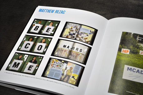
Even though some of the work overlapped between the different studios the range of styles presented gives a thorough overview of the evolution of modernism and Swiss typography in present day design culture. Hardisty does an excellent job of being as thorough and exhaustive in his exploration of the styles and the samples of work are as inspiring as his dedication.
(Click to enlarge)
In the introduction Hardisty valiantly tries to assure you that this is not your normal book on typography, modernism or minimalism. While I do not wholeheartedly agree that the book breaks entirely away from the norms, it is certainly a refreshing approach to a bold style of typographic design.
I Heart Design is published by Princeton Architectural Press and you can purchase it from Amazon (US|CA|UK|DE).
About the Reviewer Dominic Flask is a designer by nature, a teacher by application and a thoughtful companion by friendship. You can view his design portfolio here, his place of work here, and his in progress work here.


