Characters: Cultural stories revealed through Typography
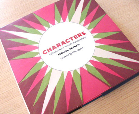
Review by Veronica Grow
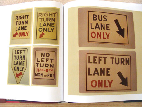
Like most typo cognoscenti, Stephen Banham is fondly known for being somewhat fanatical and nerdy on the subject of type and letters. In my opinion, it takes the obsession of one such fanatic to compile such a vast treasure of information, so clearly, in the form of this fascinating book named Characters. Characters focuses on the cultural role that typography plays (especially in the guise of signage) in defining the flavor and character of the City of Melbourne, Australia. Banham states that it is his intention to “offer a new way of looking at the familiar”.
Banham, who comes from Melbourne, has quite a weighty reputation as an authority on the topic of typography. Baseline magazine, Emigre, Adbusters, Face, Typo, Eye and Monument are just a few of the publications to which he has contributed on the subject. His body of work over the last 17 years has provided valuable commentary and insight into the changing nature of graphic design and typography as a cultural phenomenon.
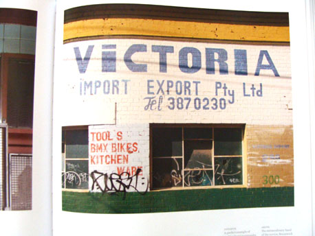
The book is engaging because essentially it is the story of Melbourne told through pictures and anecdotes of its signage. And Banham really knows how to tell a good story by focusing not only on the quirky and unusual, but also the minutia of detail. Often when I was reading Characters I saw parallels to my enjoyable reading of More Please by Barry Humphries that tells his story of growing up in Melbourne in the 1950s. But Banham was not around in the fifties and sixties and so deserves respect for the many lonely years of research and interviews that he has compiled, unearthing dozens of stories and hundreds of pictures included in the book.
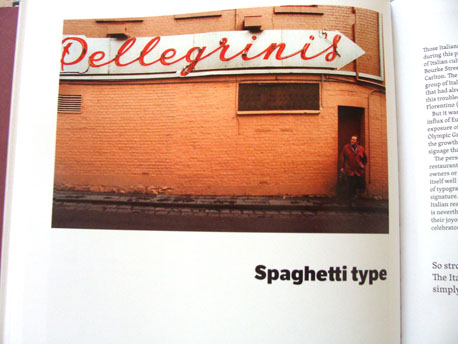
I enjoyed the interviews with everyday folk who talk about constructing signage, and their memories and evocations caused by well known but now vanished neon landmarks. We should thank Banham for recording the stories of the everyday, for they are the very valuable cultural fabric of a city now lost forever. One such story is that of Ian ‘Podgy’ Rogers, the Neon maintenance man who worked on the Craven A Filter sign:
“Craven A Filter was one of the largest roadside signs ever made. It was just over the Princes Bridge at the start of the railway. Had over 800 bloody globes in it. Late one night I was working on it and I was that bloody tired. Rang my missus and said, ‘I won’t be home tonight. I’m going to sleep with this Sheila called Craven A. She’s cravin’ for me.’ She asked where I was and I said, ‘I’m sitting up in the sign above the Yarra River and I’ve got about an hour of work to do. I’ll have a sleep here tonight.’ So I crawled into the corner, put my toolbag under my head and didn’t wake up until eight the next morning.
Podgy is one quintessentially Australian character who helps give the book its flavor. Banham goes on to recount many more stories, ideas and themes in the book (53 in all), making it valuable for anyone who is interested in the shaping of the identity of cities. I like his plain, clear and accessible writing, which lends an authenticity to the book.
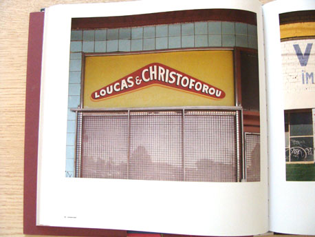
Thought provoking historical photographs profoundly demonstrate the significant change of many well-known landmarks in Melbourne. I have to say I felt a sad nostalgia for my childhood when I skipped through the book, reminded of the rich visual language and character that Melbourne and my home city of Adelaide have lost. Today they have been transformed into just other cities in our international landscape, with few distinct local features.
If you are a practicing Graphic Designer, Town Planner, Architect or Place Maker, the book will help you gain greater depth and understanding of how type and lettering define the vernacular style of a city. For the Graphic Design student, Characters will enable you to understand the relevance of your practice as someone who shapes our culture. The ideas and notions within the book hold valuable teaching project reference and ideas for Communication Design lecturers, who I believe should be creating project briefs that centre on the same topic. The book would make a wonderful gift, being a valuable reference for the many years to come.
–
Characters: Cultural stories revealed through typography by Stephen Banham is a joint publication by Thames and Hudson and The State Library of Victoria. You can purchase it on Amazon (US|UK) or find it directly in The Designer’s Review of Books Amazon store.
About the reviewer
Veronica Grow is from Old School the New School for Design in Melbourne, Australia. She is an ethnographer, illustrator, publisher, graphic designer and educator who is interested in telling stories with pictures and social design. You can follow her on Twitter under @oldschoolthenew.

