The journey of larks, Life and Punctuation..?

I have been delaying reviewing User Design’s – aka Thomas Bohm’s – series of self-published illustrated books, The journey of larks, Life and Punctuation..?. Partly this has been a lack of time, but partly it is because I’m not quite sure where to situate them. I’ll take each book in turn:
The journey of larks
(Click to enlarge)
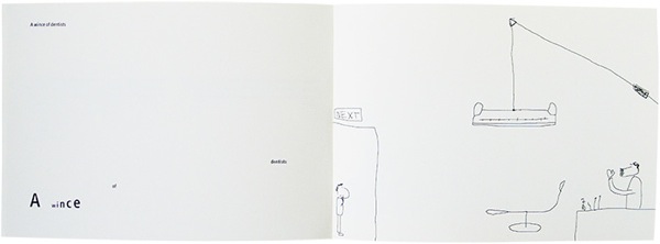
The journey of larks is a play on collective nouns: “a failing of students,” “a snooze of lectures,” “an incredulity of cuckolds,” and so on, each with a matching illustration. Some of them are amusing, like “a wince of dentists,” others simply baffling, such as, “a gang of elks.” Is that funny? I’m not sure I get the reference.
Life
(Click to enlarge)
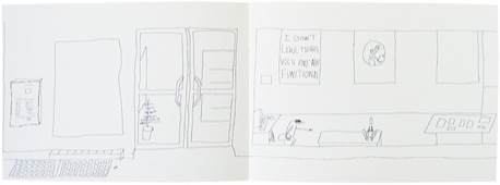
Life is billed as “a pure picture lead book (no text) story about one day in the life of somebody.” It is set in a kind of mixed “Denglish” – German and English – landscape, with Aldi and Tesco featuring back-to-back, It’s kind of charming in its banality, but soon flipped through.
Punctuation..?
(Click to enlarge)
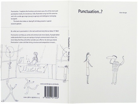
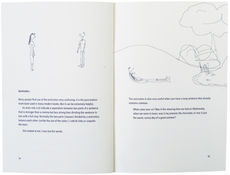
Punctuation..? is by far the best one of the three. It is yet another book on punctuation. Apostrophes, commas, brackets, etc., form the bulk, but there are some nice cultural additions, such as Guillemets («these») and the Interpunct (a dot between words used in latin・texts・like・this). Unlike most books on grammar and punctation, this one is friendly rather than curt and preachy and the ideas are illustrated in the Bohm’s style.
Bohm’s illustration style is what I would describe as “naïve mousework”. I have no idea if he draws on paper and scans it in, uses a tablet and stylus or the mouse, but it has the feel of a child drawing on the computer for the first time with the mouse. I do not mean this condescendingly. It is what it is, but is not particularly my taste. I blame myself here – and years of being taught to “draw realistically” in school – for this lack of appeal to my senses, but I can see that others will like this. In its style, it is well done, with a decent amount of character and wit. The naïve style belies the skill in knowing what to leave out and simplify.
Physically, each one is a 30-35 page affair, printed on high quality, cream, heavy 160gsm paper in near A5 format. The covers are 350gsm and both papers are from Antalis McNaughton. As self-published books go, they feel good in the hand and appropriate to the artistic content between the pages.
So, where to situate them? Illustration? Writing? A bit of both or neither? I’m not sure it matters. I suspect the target market for these books are people looking for a gift for someone. They are not the kind of books that you will find in every bookshop and you will be supporting an independent, self-publishing effort, which I think is a good thing.
You can buy the books directly from User Design’s site or via Amazon: The journey of larks (Amazon), Life (Amazon) and Punctuation..? (Amazon).
About the Reviewer
Andy Polaine is the founder, publisher and now editor-at-large of The Designer’s Review of Books. Apart from that, he is a service designer, writer, lecturer and researcher. He is co-writing a book on service design soon to be published by Rosenfeld Media. You can find his other musings on his own site or as @apolaine on Twitter.


