

Mobile Web Design by Cameron Moll
Mobile the user; not mobile, the device. Mobile is more than just being wireless. Mobility transcends freedom from wires; it suggests an entirely different user experience.
This quote from Mobile Web Design by Cameron Moll sums up the essence of his book perfectly. When designing for mobile devices, designers and developers need to think about more than just aesthetics. The portability of mobile devices has placed a much greater need on designers to understand the context of use, and how using your phone on a train for example, can influence a users experience and focus.
Mobile Web Design offers itself as a starting point for those who are interested in the future of the mobile web. The book is not highly technical, instead it covers the methodology behind creating content for mobile devices and some tips to get things rolling.
The importance of comprehending context - circumstances and conditions that surround a place, thing or event - within the mobile environment cannot be overstated….Consider how you access content on your mobile device. You’re on the subway, or your walking to your next appointment. You’re holding your handset in one hand, coffee in the other. You’re glancing up to prevent a run-in with a pole or to be sure you haven’t missed your stop.
The book offers some great insights into how creating websites for mobile devices requires a different way of thinking than traditional websites. Moller explains how to think about the limitations of the mobile web such as small screen size and data input and analyzes different approaches for dealing with those issues. He contrasts that by discussing some of the opportunities that the mobile web provides such as location-specific data and increased connectivity.
While the book contains some useful strategies you can use to improve your designs, it falls short in a couple of areas. The largest of which is not it’s own fault but the speed at which the mobile web is advancing. The book was published in 2007 and some of the examples are showing their age. The book doesn’t even mention the Android operating system (it had not been released) and only briefly mentions the first generation iPhone.
[caption id="attachment_2717” align="aligncenter” width="449” caption="Some of the phones used as examples."]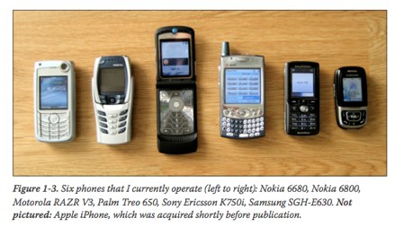 [/caption]
Despite some issues with dated examples, the books age helps raise some of the most interesting questions.
[/caption]
Despite some issues with dated examples, the books age helps raise some of the most interesting questions.
Is the browser model a flawed approach for mobile? Does it encourage miniaturization of content? Should we look entirely beyond the browser and leverage only technologies created specifically for mobile devices?
The book highlights the fact that the main hurdles in mobile web development haven’t changed for a long time. Small screen sizes and data input are still at the forefront of issues that designers must deal with. Browser compatability is less of an issue now than it was 5 years ago, but the battle between browser content and installed applications is still wide open. The book discusses all of these issues in detail and goes over the pros and cons for the most common solutions to each of the problems.
With a price tag of 99 cents (ebook) and weighing in at 100 pages Mobile Web Design won’t make a dent in your wallet and is definitely worth the time it will take you to read it.
Mobile Web Design by Cameron Moll is self published. The book is available from the books website or Amazon in PDF and paperback.
About the Reviewer Adam Fraser is a software developer from Brisbane, Australia. You can find his blog at codepo.st and follow him on twitter @code_post.