Ken Garland: Structure and Substance—review and interview
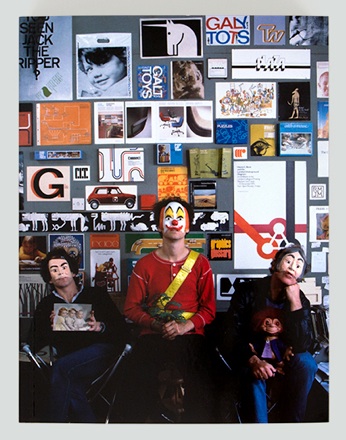
The smell of Cow Gum rubber cement and the fascination of stacked Letraset trays form a large part of my childhood memories of afternoons spent at my father’s graphic design and advertising agency. The bookshelves were also a place of wonder for me. I would leaf through Graphis annuals, reference books and other monographs and frequently come across the work of Ken Garland. Of course, I did not know his name back then, but reading through Ken Garland: Structure and Substance from Unit Editions brought back many memories.
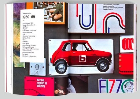
The book is part trip down memory lane (for British graphic designers, at least), part retrospective monograph and part biography of Ken Garland. Adrian Shaughnessy put together Structure and Substance and wrote the essay, which makes for an engaging and detailed account of Garland’s life. Alongside this account of Garaland’s work and clients, the book is peppered with interviews and quotes from former colleagues and students. These give the best flavour of Garland’s manner and style, such as this quote from John Morgan, a former student on the BA Typography & Communication course at Reading University in the 90s:
"He didn’t look like the other staff members, he wore a small colourful hat, the sort you might pick up in Camden market, and his language was peppered with ‘fucks’ and ‘fucking’. He once walked into the room to find me doing an impression of him (I was wearing a hat substitute and swearing). I was of course very embarrassed. Ken coolly said “as you were saying”. He certainly and rightly gave me a side-ways look from then onwards.”
Garland is perhaps best known for his First Things First manifesto from 1964. It was, Shaughnessy writes, “eagerly embraced by students and young designers rebelling against the idea of graphic design as no more than the compliant handmaiden of consumerism and glossy corporate branding strategies.” In some ways this manifesto has overshadowed Garland’s design work, but, as Shaughnessy explains,
"Ken Garland conforms to no stereotype. As we will see in the following pages, just when we think we have him labeled - angry political agitator; crusading anti-commercialist; card-carrying modernist; conventional client-focused designer - he confounds us by revealing an aspect of his character that is wholly unexpected.
He has a disarming ability to provoke surprise. He famously dropped his trousers on stage, and on another occasion smashed a mobile phone as part of a lecture. I once saw him chair a debate on the role of the designer in society. Speaker after speaker berated their clients and blamed many of the shortcomings of the modern design scene on evil commissioners. At the end of the discussion Garland said that he wished to put on record that many of the relationships he had with his clients over his long career were amongst the most rewarding relationships of his life.”
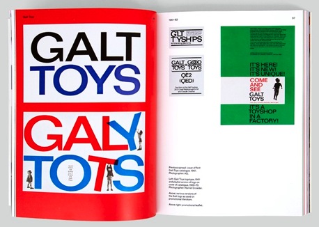
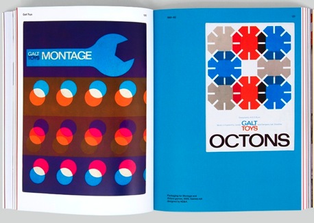
My childhood graphic design memories are of Garland’s work for Galt Toys, which stood out for me even back then. Galt Toys was actually called James Galt and Co., but the placement of Galt next to the word ‘Toys,’ “proved so successful that soon everyone was calling them “Galt Toys” and assuming that to be their real name. At first they were a little disconcerted by this but eventually accepted the inevitable,” says Garland.
His work with Galt is an example of his versatility and interest in different technologies and how they might be put to good use (he is an accomplished photographer). At the same time, the provocateur side of him was keen to mix things up in a way that feels very contemporary:
”[We] were determined not to let the Galt Toys logo become a sacred cow, not to be mucked about with (as was decreed with so many logos in the 50s and 60s). It would, indeed, be mucked around with, but only by us. There is, I have to say, more than mere whimsy in these variants. With the eager involvement of my Associates I was totally devoted to breaking down the tyranny within which logotypes were normally constrained. I felt that they were best used as the starting point for design ideas, rather than as an inviolable, enshrined entity.”
Garland was and is always proactive. He and his Associates moved beyond their standard brief as graphic designers and engaged in working across many of Galt’s “touchpoints,” as we might call them today. They designed Galt’s posters, print material and mail-order catalogues, of course, but also designed wooden toys and games for the company.
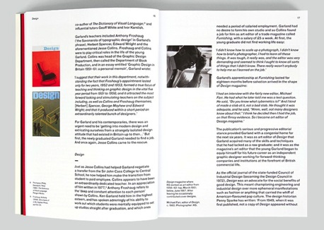
Reading Shaughnessy’s text, one gets the sense of a complex man with an eternally enquiring mind. At the same time, there’s a sense of the roguish charmer and provocateur ready with an acerbic when required. Most report Garland as charming and inspiring, yet it is clear that he also does not suffer fools gladly. I had the opportunity to fire off a few interview questions via e-mail. The questions and responses are published here in full and unedited.
A short interview with Ken Garland
AP: This book charts your personal journey as a designer, teacher and photographer over many years. What was your first exposure to graphic design that made you think, “that’s what I want to do” or was it not so clear?
KG: At my first London art school, The John Cass College, there was an inspiring teacher called James Broome-Lynne. He convinced me that my future should be in graphic design rather than in illustration. This was the first time I had heard the phrase ‘graphic design’. He urged me to switch from the John Cass to the Central School of Arts and Crafts, which I did, for the last two years of my four-year course. I was welcomed there by the head of department, Jesse Collins, who became a most significant influence.
AP: In some ways Western society seems to have become less political than the days of the 60s and 70s and graphic design seems to have less political impact than it used to. The ubiquity of cameras in everyone’s pockets on their mobile phones has also changed the face and position of photography politically and, indeed, ethically. Do you agree with that assessment or do you think graphic design and photography still have the impact they used to?
KG: Students are no longer as interested in the orthodox political parties as they were in the 1960s; but they are just as concerned with social change, with the environment and with the plight of the underprivileged.
AP: You’ve been lucky to witness the explosion of and dramatic changes in the technology used to create graphic design and in photography and, looking through your work, there is a real rigour to the simplicity you have employed. How do you think the “everything is possible” aspect of today’s technology affects the way designers go about their work?
KG: Sorry, but this question is too vague for me to find a useful answer.
AP: Students, of course, now face a bewildering range of career and technology choices and cross disciplinary boundaries much more fluidly that ever before. What challenges and opportunities do you think that creates?
KG: It depends on the student. There are some (and I think they remain important) who have very simple, direct objectives. They may find the variety of opportunities confusing. It should be the role of teachers and senior designers too help them make choices. Some of my best Associates have been modest, not pushy. They needed to be nurtured.
AP: I deliberately left this one until the middle. Looking back at the 1964 First Things First Manfesto (yes, that again) it seems even more relevant today than ever before. I know you are asked about this all the time, but what is your sense of the impact FTF had or the position it has today?
KG: FTF was never a call to arms but an alert, a polemic, a basis for discussion. That remains as urgent and relevant as ever.
AP: Are the ethical considerations the same or different for today’s young designers?
KG: They are exactly the same.
AP: The book quotes your essay The Rise and Fall of Corporate Identity in which you wrote, “we are faced with this inhuman imposition of imagery when what we really want is to celebrate how different we all are.” This, to me, seems to sum up at least one side of the commercial world today. The other side, of course, is the explosion of self-display online via websites, blogs and social networks. What is your view on these developments?
KG: There is no comparison between the arrogant intrusion of monster corporate identities in all aspects of our lives and the profusion of online messages and imagery. The former is inescapable; the latter may be avoided at will.
AP: Your book also illustrates how multi-faceted you are in your work. Personally, I feel I have learned more about creative process through writing than I ever have through design and have come to realise I am probably a better writer than designer. I also learn a great deal through mentoring students. I wonder if you see your writing, photography and teaching as activities distinct from your graphic design “persona” or whether they are much more integrated for you and how much they influence each other.
KG: For me, they are completely integrated and always have been.
AP: You probably get asked this ten times a week, but to paraphrase Burt Bacharach, what does the design world need now?
KG: Good, sympathetic clients with lots of money.
AP: Lastly, The Designer’s Review of Books is, as the name says, a site that reviews design books. If you had to pick three books that have influenced you the most throughout your life, what would they be?
KG: ‘The practice of design’ (1946), not because of the text but because of the design by Hans Schleger (‘Zero’); ‘An essay on typography’ by Eric Gill (1931); ‘John Heartfield’ by Wieland Herzfelde (1962).
It is hard not to be a little disappointed by the rather glib response to my “everything is possible” question. I admit to its slight vagueness, but I was sad not to get a response when I followed up with more detail. The question about technology is relevant and I would have loved to hear Garland’s views on it.
When it was only possible to create rough layouts and typography by hand, before it went off to a typesetter, the process was not only much slower, but also required great expense to end up with a finished object, such as a printed brochure. This meant that there was more time to think through everything before the final output. Digital printing and other technologies have collapsed this process into one. A process that used to require a range of different specialists with specific equipment and training can now be achieved in one or two Adobe applications.
As someone who remembers watching the designers in my father’s agency having to go through so many processes to end up with a finished piece of print work in their hands, it still occasionally amazing me that I can send an InDesign page to my desktop printer and get nearly the same results within minutes.
Naturally, this is not a revelation, but it does change the way designers relate to what they are doing. My own experience of teaching MA Design students is that they struggle not with not having an idea, but with having too many, because everything is possible to them now. That does change the relationship to design and, indeed, the ethics of design and client relationships (what designer has not had the “can’t you just Photoshop it?” conversation?).
I once interviewed the venerable Milton Glaser, also in his eighties, who had a similar, slightly world-weary tone as if he had had to answer these questions all his life. I imagine he has. To be fair to Ken Garland, he has just had a book of his life’s work published, which should answer them all and perhaps it is only fair that when you are in your eighties, it is now someone else’s turn to deal with this questions. Structure and Substance is certainly a must-read for all graphic designers, especially those from outside of the UK, who might not be so aware of the history of graphic design on this side of the Atlantic.
Ken Garland: Structure and Substance is published by Unit Editions
Author: Adrian Shaughnessy
Paperback
168x224mm
328 pages
ISBN 978-0-9562071-9-7
Published: December 2012
About the Reviewer
Andy Polaine is a service and interaction design consultant, writer, educator and Editor of The Designer’s Review of Books. He is co-author of the Rosenfeld Media book, Service Design: From Insight to Implementation. He blogs at polaine.com and can be found on Twitter as @apolaine.

