A Logo for London
Review by Paul A. Ranogajec
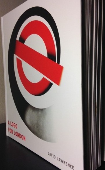
London Transport’s logo–known as the roundel, circle and bar, or bulls-eye–easily counts as one of the most successful graphic designs of all time. It has been a constant and increasingly ubiquitous feature of London’s streetscape for over a century. In his book, A Logo for London, David Lawrence describes the logo as “exemplary for its clarity and consistency, and for being universally recognizable.” He reveals how the logo has been subject to a surprising number of iterations, inflections, and adaptations (official and unofficial).
 [
](/images/2014/11/ex6-e1415370476688.jpg)
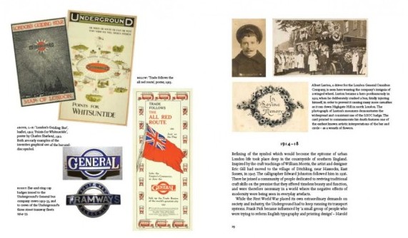
After a whirlwind introduction setting the roundel design into a broad context of both circle symbolism and brand development (a section I wish had been much expanded), the first four chapters describe the circuitous route and complex efforts to settle on a design. Lawrence traces the origins of the roundel to 1905, when the earliest version of a ring-and-bar logo for a transportation operator can be found on buses of the London General Omnibus Company. These carried a signboard featuring Hermes’s wings on a spoked wheel with the word “General” inscribed on a horizontal bar.
By 1907, the Underground Group of London’s transport companies was busy constructing new, deep-level “tube” railways. The company hired Frank Pick as head of publicity and Albert Stanley (later Lord Ashfield) as General Manager. Lawrence credits them with developing the first unified design program for the underground railways. This was also the year in which architect Harry Ford’s “UndergrounD” logotype (with capital U and D) first appeared. It consisted of white letters on a blue ground and white bars or counters above and below the letters.
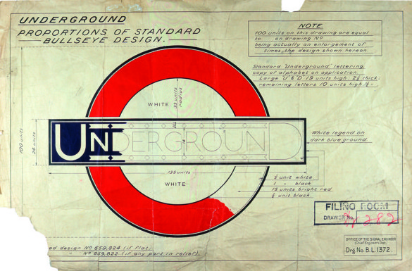
In 1908, Pick and his team began to revamp the display of station name signs. Until then, the signs had been difficult to distinguish amid the visual clutter of competing advertising posters. Taking the Paris Metro as a model, Pick installed large signs with clear lettering. He quickly decided to place red half-discs above and below the nameplates to further distinguish them.
Pick commissioned calligrapher Edward Johnston, a devotee of William Morris, to create a distinct typeface for the Underground; this went public in 1916. Johnston’s project subsequently grew into a wholesale redesign of the disc-and-bar nameplate. In 1917, Johnston’s new bulls-eye or ring logo was rolled out and in 1918 first used on a poster for the rail network.
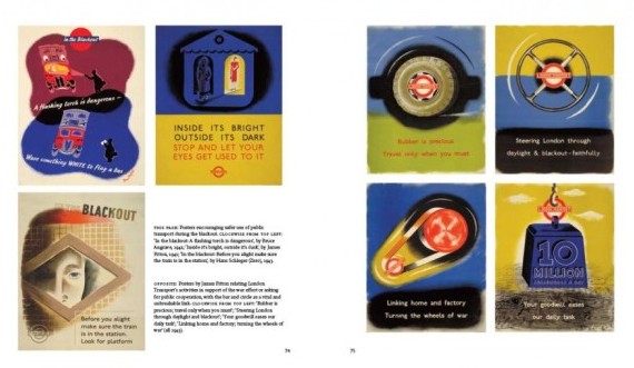
Lawrence then details some of the refinements to the design and its varied uses through World War II. He provides a fascinating transcription of selected correspondence between Harry Carr, a publicity officer working for Pick, and Johnston. These very brief excerpts are enough to suggest the seriousness with which the designers and publicists took the task of developing the company’s visual identity. Carr and Johnston’s letters show that careful attention was given to the subtleties of both typography and abstract design. In a 1933 report, for example, Johnston describes letter spacing adjustments to the hundredth of an inch and shows great concern for maintaining the “clean cut structural effect” of the bulls-eye design.
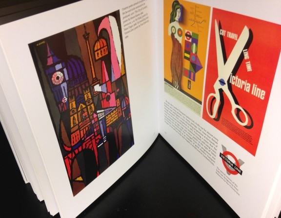
In the second half of the book, the text brings the story up to the present day, mixing in thematic sections with ongoing attention to the complicated, ever-changing structure of London’s transportation bodies. Too often, though, these later chapters seem perfunctorily written and under-conceptualized. For instance, Chapter Eight offers a small selection of artworks drawn from the Art on the Underground initiative of recent years, reproduced without commentary. Some context beyond the single introductory paragraph would have helped readers understand the art. The lack of text led me to wonder why this particular set of works had been chosen from the many available.
In other parts, the text reads as if it had been written by the publicity department of London Transport. In Chapter Nine, for instance, Lawrence adopts language more appropriate to a press release than to design criticism or history (discussing, for example, “comprehensive retailing strategies”). And he sometimes passes by important, complex issues of context. In one instance, he notes the fact that “devices and images of national identity and capital city are eminently saleable in this time of intense consumerism.” This raises the question of how far we–citizens, collectively–are willing to go in commodifying national or urban identities. It is a question designers are well placed to engage. I can’t help but think Lawrence missed an opportunity here to present an alternative way of thinking about design in relation to London’s visual identity “beyond the market,” so to speak.

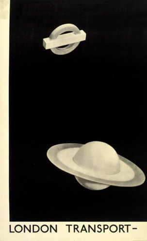
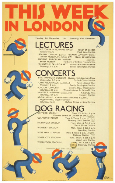
The main attraction of this book are the images, which show the roundel in various guises in advertising, signs, art posters, pamphlets, and ephemera over many decades. If the text is sometimes dry and mechanical, or too naive, the images will still delight anyone interested in graphic design or the history of London’s visual culture. The early periods offer some of the cleverest examples: Man Ray’s visual pun that turns the flat circle and bar into a Saturn-like celestial object; “Will you walk into our parlour for Easter” by Charles Sharland; and, later, Hans Unger’s “Art Today” advertisement from 1966. Perhaps the book’s biggest revelation is to show just how much London Transport has been an incubator for poster and advertising art.
A conspicuous visual omission is the London Underground map. There are some covers of rail and bus pamphlets, but no images of the map itself. Of course, a short book that surveys a century of history cannot cover everything. Yet one or two representative examples of the map–surely a defining element of London’s transportation system–would have made the selection more complete.
The book’s narrow focus on the roundel design fills a gap in the coverage, taking its place among the many recent publications on all aspects of London’s transportation systems. It is also well designed, informative, and very reasonably priced–all of which is sure to appeal to designers and Londonophiles alike.
A Logo for London is written by David Lawrence and published by Laurence King. You can support the Designer’s Review of Books by ordering from Amazon (US|UK|DE).
About the Reviewer
Paul A. Ranogajec is an independent art historian based in New York City. He can be found online at paulranogajec.tumblr.com.


