Abbott Miller: Design and Content
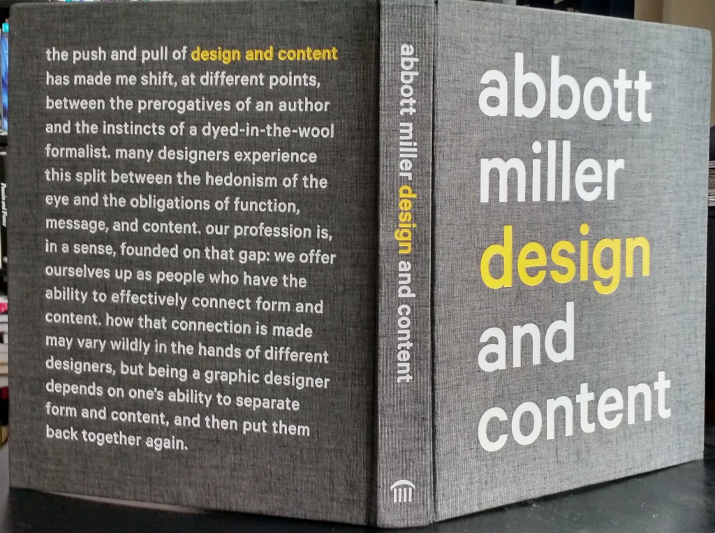
The recent monograph, Abbott Miller: Design and Content, provides a wealth of evidence for seeing Miller as one of today’s exemplary designers. In my view, this is not for any set of particular projects or for any distinctive Miller style, but for the way he has oriented himself within the design field. I see this orientation as having four parts, based on this book and on some of his previous writing, especially his pioneering Design/Writing/Research: Writing on Graphic Design (1996, co-written with Ellen Lupton, now his wife).
First is Miller’s intellectual ambition, expressed in clear writing that is not afraid of theoretical complexity. He and Lupton, for instance, manage to make Derrida comprehensible as few others have (how well they present an accurate account of Derrida’s abstruse writing is another question). This engagement with literary, design, and art theory is not strongly evident in Design and Content, but it can be traced in his continuing interest in the relation of the visual and the textual found in many of the projects in the book (his own suggested reading list is revealing on this point). Certainly other designers have intellectual ambitions, but Miller’s engagement with ideas takes him beyond the narrow confines of professional discourse. Most importantly, he knows how to make difficult ideas accessible. His and Lupton’s 1993 essay “Critical Wayfinding” is, for instance, one among several that should be considered required reading of all design students. He seems to be doing less writing today, but his written work remains an important part of his professional identity.
Second is Miller’s interest in the adjacencies and congruencies between design and art, what in an earlier, important interview (Eye, Autumn 2002) he described as the “fluid overlaps” between the fields. In one of the book’s prefatory essays, Miller writes about this issue with his signature directness in the context of describing his own emerging professional identity during and after his time as a student at the Cooper Union in New York: “I liked how the context-driven culture of design immediately placed you at the intersection of form and content. I found myself feeling more confident making ‘art’ that was closer to design in its use of narrative and in its engagement with messages and ideas” (p. 9). One crucial formative experience was his studio course with artist Hans Haacke, whose politically-engaged works and projects in the vein of “institutional critique” helped Miller navigate the gray zone between design and art. A clear result of his synthetic view of the art and design fields is his continuing dedication to the production of artists’ and architects’ monographs and to exhibition design. The former is underrepresented in this book, but his exhibition work is well covered.
Third is Miller’s expansive understanding of design as more than logical or mechanical problem-solving. In her prefatory essay, Lupton makes clear that Miller sees “design as part of cultural production in general, where he [is] less like a translator and more like an interpreter” (p. 24). His practice is mostly graphic design (books, posters, logos, and identities) and exhibition design and art direction: by my rough count, 59 of the approximately 63 projects in the book are in these genres. But when we consider his work along with his writing, I cannot help seeing an analogy to what Alberti and Vasari did for the visual arts in the Renaissance: claiming the space for design as a liberal art.
Finally, underpinning all the others, is the idea that design should be an ethical practice. Miller sees design as a way to offer alternative perspectives and to create narratives, and not just products, for both clients and the wider public. In his understanding, the designer must take on the role of shaping content and not simply of manipulating form independent of that content. This conviction is the basis for the title of the monograph itself. He has said in a recent interview (Co.Design, Sept. 8, 2014) that graphic design used to be a kind of “dark art.” But with the digital revolution, and the internet to incubate it, there is now an “incredible breadth and public quality to people’s awareness” of graphic design. As is beautifully conveyed in the book, Miller’s own career has helped advance this growing publicity of design, bringing it to a wider nonprofessional audience. I say this is an ethical issue because it means the difference between an esoteric practice closed but to the few initiates and a practice engaged in public conversations. Another component of the ethical is the fact that Miller is keen to acknowledge and articulate the limits of design. To take just one example, he sees “branding” as having become an “oppressive” and “colonizing” idea, out of proportion to its real efficacy. He prefers to think, instead, about identities and narratives.
I am sure it is possible to characterize other high-profile designers in similar terms. But that does not detract from the claim that Miller’s work offers a distinctive orientation within the field. None of this is to say that the book satisfactorily treats all of these ideas. And it has some distinct shortcomings: there is too little critical comment on the illustrated projects; not much interest in the mechanics and economics of production; and little said about Miller’s professional trajectory, especially the change from being the head of an independent studio to working as a partner at Pentagram. Lupton’s interesting but short opening essay and the group discussion with several Pentagram colleagues (Michael Beirut, Eddie Opara, and Paula Scher), included at the end of the book, shed some light on his career path, but neither are closely linked to particular projects in the book.
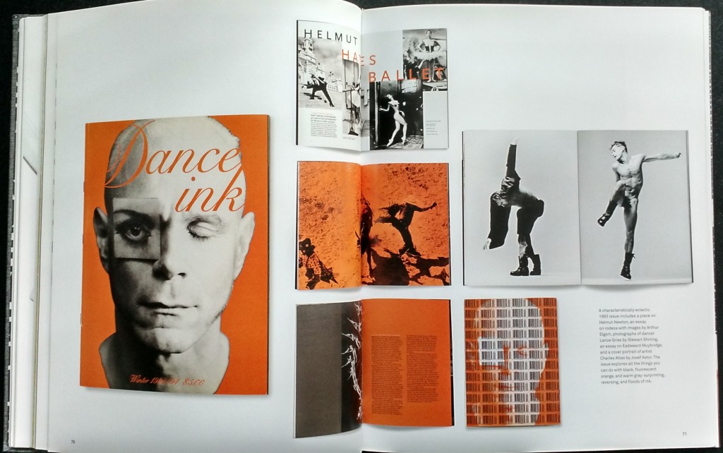
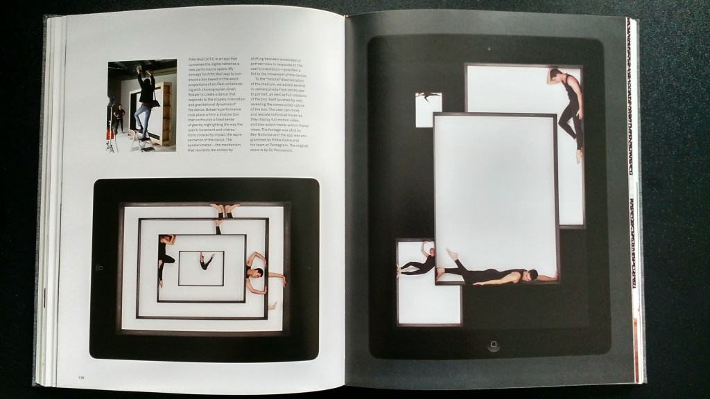
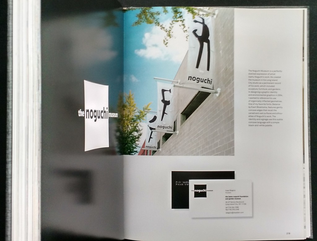
Nonetheless, Design and Content is visually stimulating, clearly laid out, and hefty enough to provide a representative overview of Miller’s career, beginning with some of his art-school projects. We move swiftly into Miller’s projects at his Design/Writing/Research studio, founded with Lupton in 1989, and then to work completed since 1999, when he joined Pentagram. Along the way, we come to understand how Miller’s design sensibility issues from a flexible but grounded process. The book also includes several of Miller’s important essays. Like all such monographs, it is a whirlwind tour, but there is just enough “content” that the alluring form does not overpower (a brief video of Miller speaking about his concept for the book is available here).
Despite the lavishness and formal consistency of the book, it remains difficult to describe Miller’s personal style, even given that the work is limited to relatively few genres. To speak generally: Miller’s style is polished, sharp, and clean. Now and then it feels safe, maybe too polite—not hesitant or tentative, but less radical than its latent potential. He can do a lot with a little material, extracting value from modest resources. Might these be characteristics of a more general New York style?
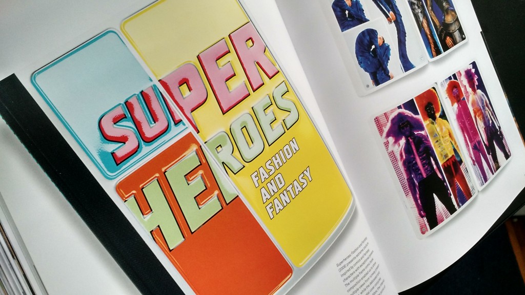
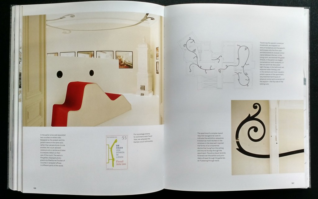
There is also a gratifyingly sensuous component to his work, which is a great thing to celebrate (it is never flashy or gratuitous for its own sake) in our times of cynical austerity: for instance, the high glossy, almost wet-looking pages of the Superheroes exhibition catalog (2008); or the lyrical eroticism of the dance photography in Dance Ink and 2wice magazines; or the serpentine tendrils twisting through the galleries of the Die Couch exhibition at the Sigmund Freud Museum, a kind of subconscious, therapeutic armature articulating the visitor’s spatial experience. Since the great majority of his work is not commercial, in the sense of products or consumables, there is a refreshing idealism and optimism coursing through much of it. The commonality is found in his respect for words, for typography, for the integration of text and form, as well as in the sense of having a thoroughgoing but non-mechanistic process to bring content and form together.
There is one more particular aspect of Miller’s style which deserves comment: his color sense. In fact, this was the most surprising element to me in leafing through the book. Above all is his surprisingly effective use of orange. What a color! In Miller’s hands, orange is gratifyingly bright, intoxicating, capable of a spectrum of effects, from a kind of naturalistic illusionism (his Brick Book installation, 1997) to serious haute couture elegance (his 1995 Geoffrey Beene book). Confident handling of color, its integral relation to content and form, marks Miller’s projects as strongly as any other single element. This unusually fine color sense—reserved, but with moments of brilliant exuberance, even a touch of judicious gaudiness—is a delightfully unexpected commonality in his work.

The resonance of Miller’s work, its integrity and beauty, is enhanced for me by some personal connections: we grew up in the same region of Indiana and attended the same Ph.D. art history program (at the City University of New York, although Miller didn’t finish). It is a thrill to find such connections in the vast world of design. And it is a testament to the role of books in our putatively digital age in bringing such connections to light. Although Miller’s book could have had a stronger critical component—perhaps I am just projecting onto it my enthusiasm for his and Lupton’s earlier Design/Writing/Research —it is a welcome archive of his career and a document of what an intellectually ambitious and ethical design practice looks like.
Abbott Miller: Design and Content is published by Princeton Architectural Press. You can support the Designer’s Review of Books by ordering this book from Amazon (US|UK|DE).
About the Reviewer
Paul A. Ranogajec is an independent art historian based in New York City. He can be found online at paulranogajec.tumblr.com.

