Shapes for Sounds
Guest Review by David Sherwin
A is for Aleph. B is for Beit. G is for Gimel…
When I was a child, Hebrew was beaten into me by a series of well-meaning teachers. Upon reflection, they were probably my first foray into hand-lettering type. Sadly, the letters stuck, but comprehension of the words peeled away past my teenage years. I have always had a nagging thought in the back of my head that if I’d seen a clearer historical thread between Hebrew and modern English, I would have better retained the language.
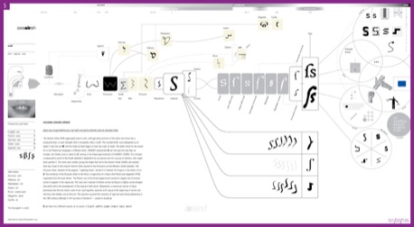
Shapes for Sounds
(Click to enlarge)
This book wasn’t written to be a mere textbook-style historical overview of type styles and trends, or meant to be considered as a practical resource on modern typography like Robert Bringhurst’s The Elements of Typographic Style
The subtitle of Shapes for Sounds is: “Why alphabets look like they do, what has happened to them since printing was invented, why they won’t ever change, and how it might have been.” On the surface, the sheer breadth of that subtitle may seem like a stretch, but Mr. Donaldson has synthesized all of the noted material into a cogent, highly readable volume. He seeks to reassert the true nature of letterforms – the fabric of an ever-evolving visual language whose boundaries were flexible until the advent of printing:
“There could not have been a Reformation, an Enlightenment, and an Industrial Revolution if there had not been this revolutionary technologising of the alphabet… Nevertheless, though this technology gave, it also took. The alphabet is frozen in the Roman and Carolingian shapes it was in when type came along. Our orthography is so deeply embedded into our systems that although we will not lose it, we cannot change it.”
When Ken Garland writes in the foreward that Shapes for Sounds “might have been confusing and indigestible… but this book is both erudite and limpid,” he is bang on. The prose of this book is drenched in wit and scholarly verve, and many pages are jam-packed with sparkling trivia provided alongside scholarly insights.
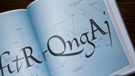
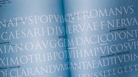
There are a number of quotes that continue to linger in my mind, such as “Typography is the engine of graphic design, and writing is the fuel." From the beginning of a section about Blackletter type: “Books = sheep + time + skill." Or, _“Trajan letters have become almost a holy relic of graphic design, an ideal but not the reality.” _
(Click to enlarge)
I read the whole book in two sittings, but to truly absorb all the information included throughout the text would take me months. Some designers might actually be turned off by the high level of diction and the frequent wink-wink moments. It felt at times like the author was struggling to tart up tough material. (Though, in lesser hands, certain passages could have been very snore-worthy.)
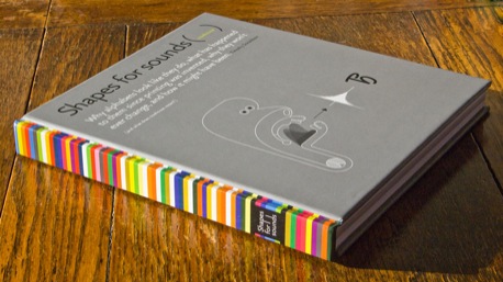
The author also designed the book within an inch of its life. There isn’t a single detail that, upon reflection, could be called superfluous. Even the spine of the book, which is patterned with a brilliant collage of colors, resolves itself into a message encoded using a color alphabet developed by Christian J. Faur.
(Click to enlarge)
Shapes for Sounds is divided into four discrete sections that build upon one another:
Sound. A taxonomy of which sounds we are capable of shaping with our vocal equipment, and how they function as the building blocks of aural and written language.
Shape. A chronological tour of how our alphabet came to be formed and utilized, from Cuneiform and Hieroglyphics to encoded, sonic, and visual alphabets that are a byproduct of modern technology. This section is mostly narrative, peppered with visual examples and references to further detail in the appendices. It also meanders to show how tongues such as Hebrew and Arabic have developed alongside our Roman alphabet.
(Click to enlarge)
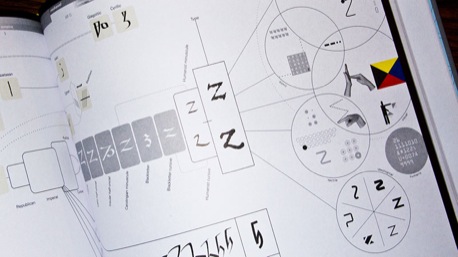
The Charts. These charts represent the trajectory of each letter’s evolution through recorded history. They are a Herculean feat of scholarship, type design, and information design that cleanly dovetail with the content provided in the previous two sections. Each chart also incorporates three “conjectural alphabets” that postulate how our lowercase letters may have formed differently.
(Click to enlarge)
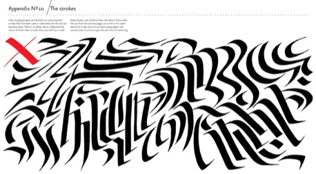
The Appendices. Much like an antique shop whose shelves and drawers are stuffed with tantalizing wares, readers may linger here and delve deeply into the linguistic and typographic minutiae footnoted throughout the text. Some of my favorites include: a demonstration of how alphabets grow over time in sophistication, from pictography (picture-writing) and logography (word-writing) to phonography (sound-writing); a graveyard of lost letters that never made it into modern English; and a chart composed of strokes that have been used to make letters for the past two thousand years – and that you can trace over as practice for crafting your own hand lettering.
For the trade that I’m currently in – interaction design, with a dash of print and brand – this book provides little more than entertainment and a shot of enlightenment. It’s not going to change the type handling in that Facebook application I’m currently designing.
But if you hand-letter type, ply your trade strictly in typography, or are a student of type history, this book could be your new best friend. And if you are simply passionate about language and want a much broader context for how you think about design as a basis of mass communications, this book will definitely spin your head as well. Shapes for Sounds helped me to answer some questions about English language and typography that had been nagging me for decades, and inspired me to re-explore the activity of hand-lettering alphabets beyond our own.
Buy Shapes for Sounds on Amazon.com


About the Reviewer
David Sherwin is Sr. Art Director at Worktank in Seattle, Washington. He maintains the blog ChangeOrder: Business + Process of Design and is writing a book for HOW Design Press on skill-building for working designers.


